Keep the wind —
in the film, and on the page.
A Red Dot and iF winning handheld fan, a TIME Best Invention — and a website that showed none of it. One TVC and one Shopify experience upgrade, built as a single narrative line.
Award-winning product, off-the-shelf presence.
Red Dot, iF, TIME Best Inventions — and a website that showed none of it: a generic Shopify template, more shelf than brand. The launch needed two touchpoints built as one narrative line — a film that sets a feeling, and a page that receives it without dropping it.
Filming the wind, not the fan.
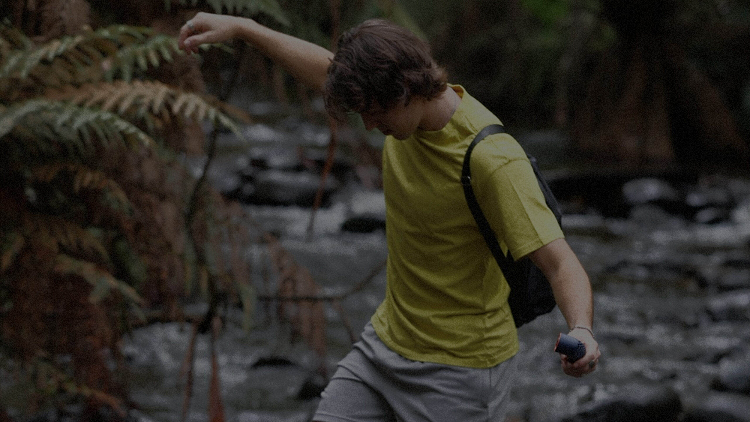
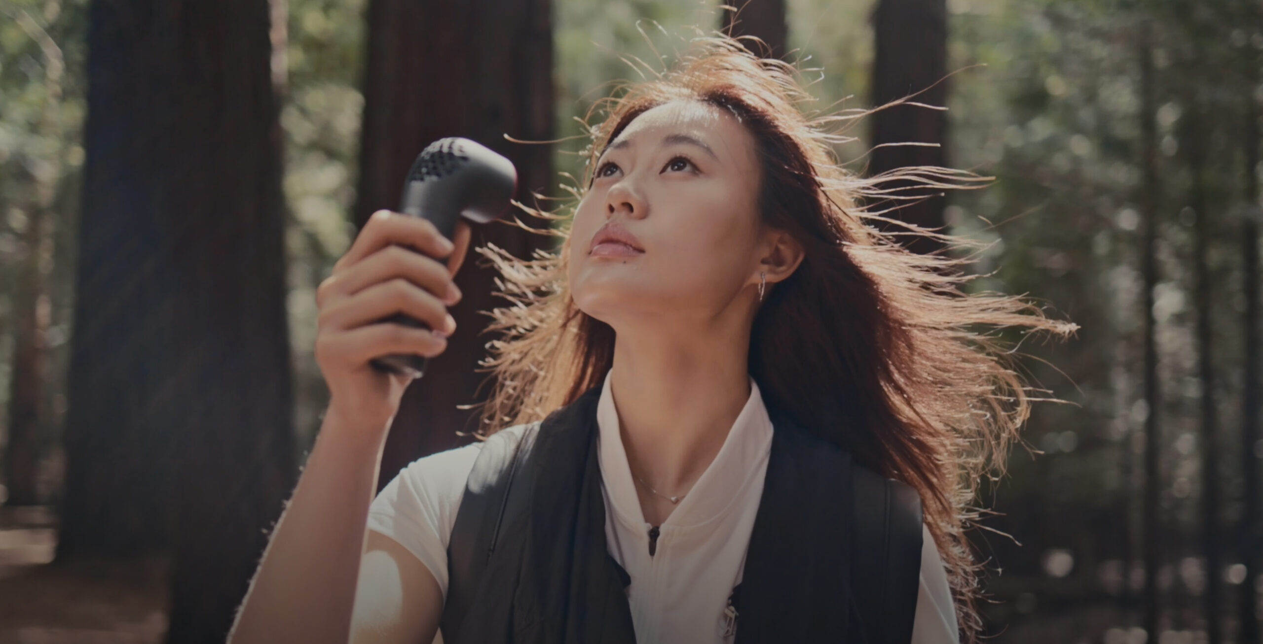
One judgment shaped the film: Aero isn't a desk appliance, it's something you carry — so every frame is outdoors, and the message is "wherever you go, it goes." The structure follows temperature: the first half builds heat in slow cuts — windless trees, asphalt haze, the gap between tennis games. Then the fan switches on, the rhythm breaks, and wind starts leaving traces in the frame — hair, shirt collars, leaves. Each scene is one hot → cool arc; stacked together, the audience knows exactly what this breeze means.

The page picks up where the film ends.
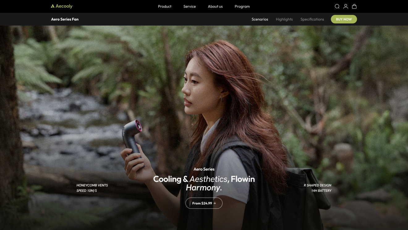
The page doesn't open with a product intro — it opens in the TVC's visual world: Gym, Road, Wild. Before any spec, the user enters a state of use. The full film is embedded mid-page; no jump, no seam.
For something you carry, the questions aren't rpm — they're is it small enough, light enough, does it come in my color. So size became a phone comparison, and the three models and colorways became an interactive selector — understand, compare, choose, all on one page. From feeling to understanding to decision: one path.
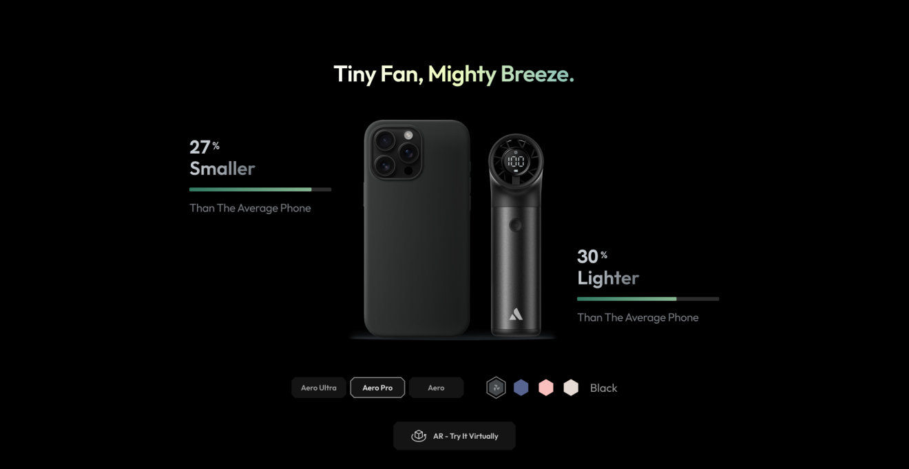
27% smaller, 30% lighter than the average phone — the comparison a carry-along product actually needs. Model and color selection happen in place, not across three product pages.
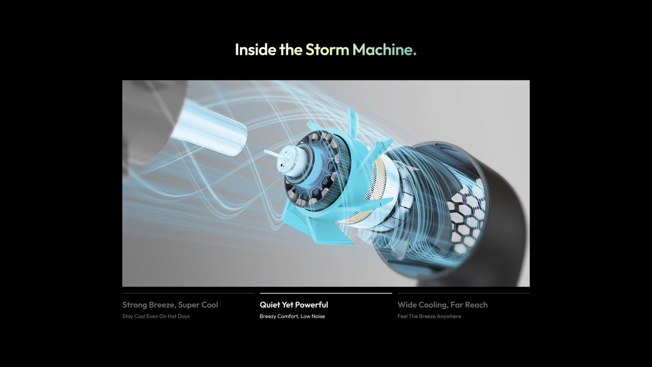
Aero isn't the cheapest in its class. After scenes and looks, the user needs a reason to trust the premium — turbine structure, brushless motor, aerospace-grade aluminum, opened up in section. Engineering laid bare beats any tagline.
From shelf to brand.
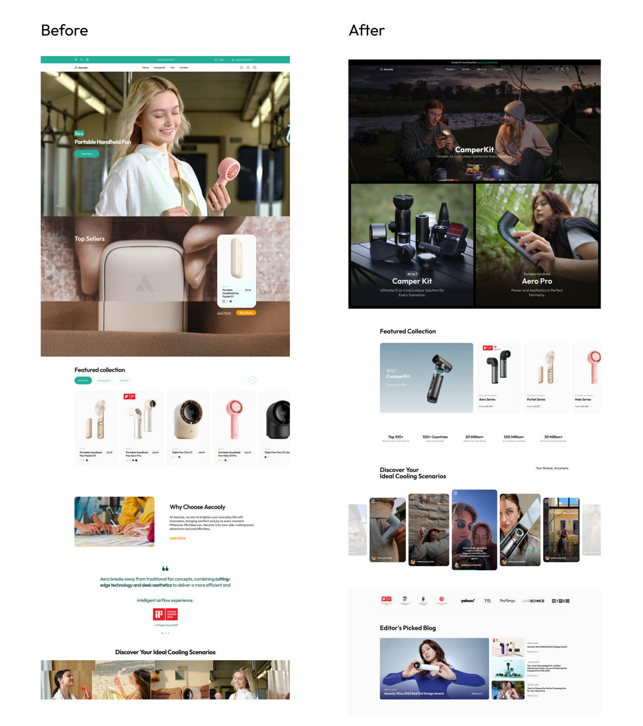
Alongside the launch we rebuilt the homepage — information hierarchy reordered so the path from arrival to product is clear, smooth scrolling and dynamic transitions so the page stops being a stack of static screens.
Every core display module is componentized. New products, a new hero, a campaign entry point — the brand's own team operates all of it, no second round of development.

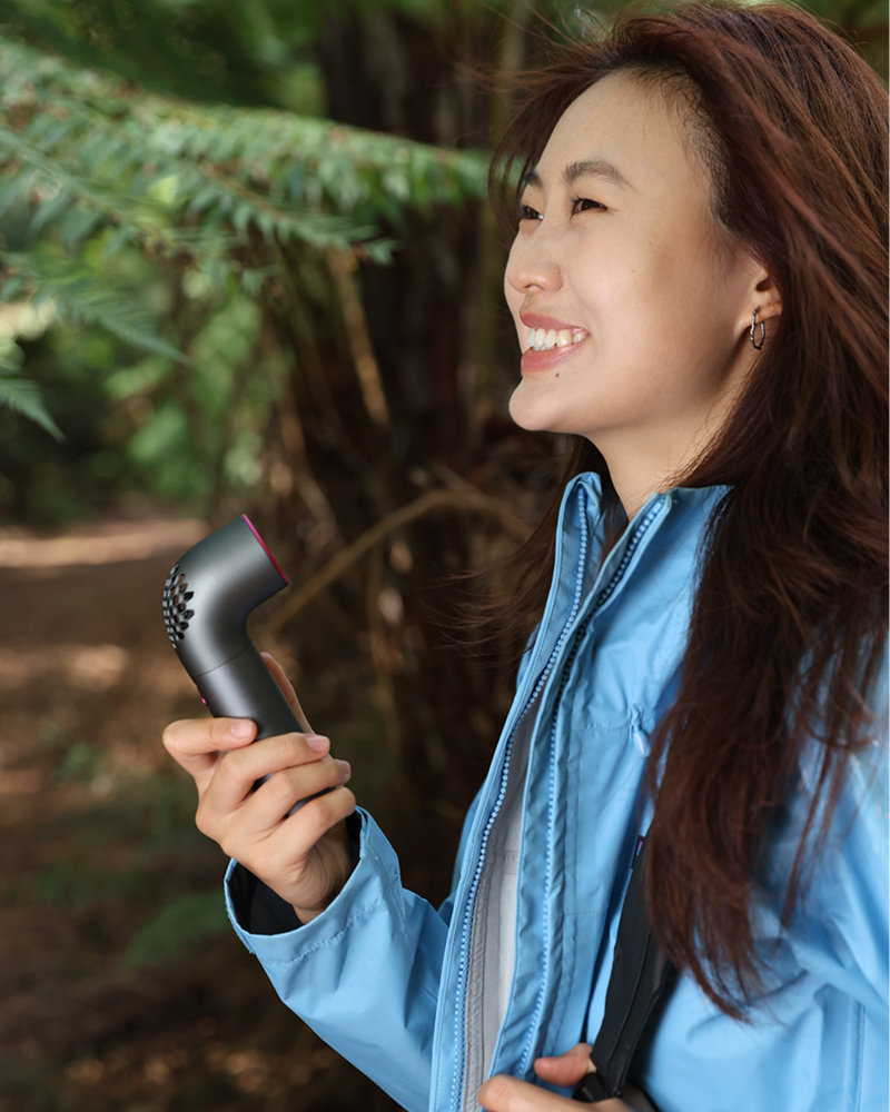
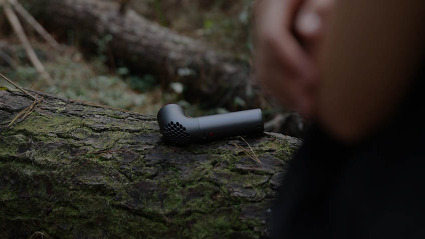
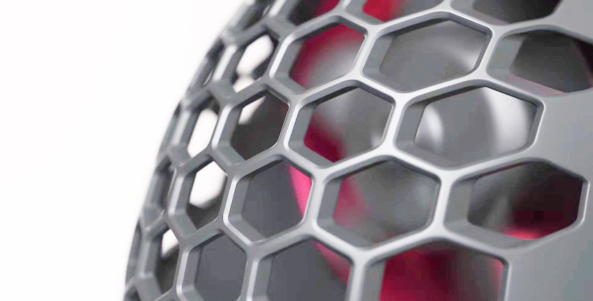
The film and the page aren't two deliverables. They're two links in one chain.
That chain only holds when video and web are planned by the same hands, from the same judgment: Aero is wind you carry. The outdoor-only frames, the heat-to-cool structure, the Gym/Road/Wild opening, the phone-size comparison — all of it follows from that one sentence.
And it keeps running without us: the Aero page is a core product entry, the TVC is re-cut per channel by the brand's own team, new products and campaigns ship with no second development — all inside the original Shopify theme. The platform was never the bottleneck.