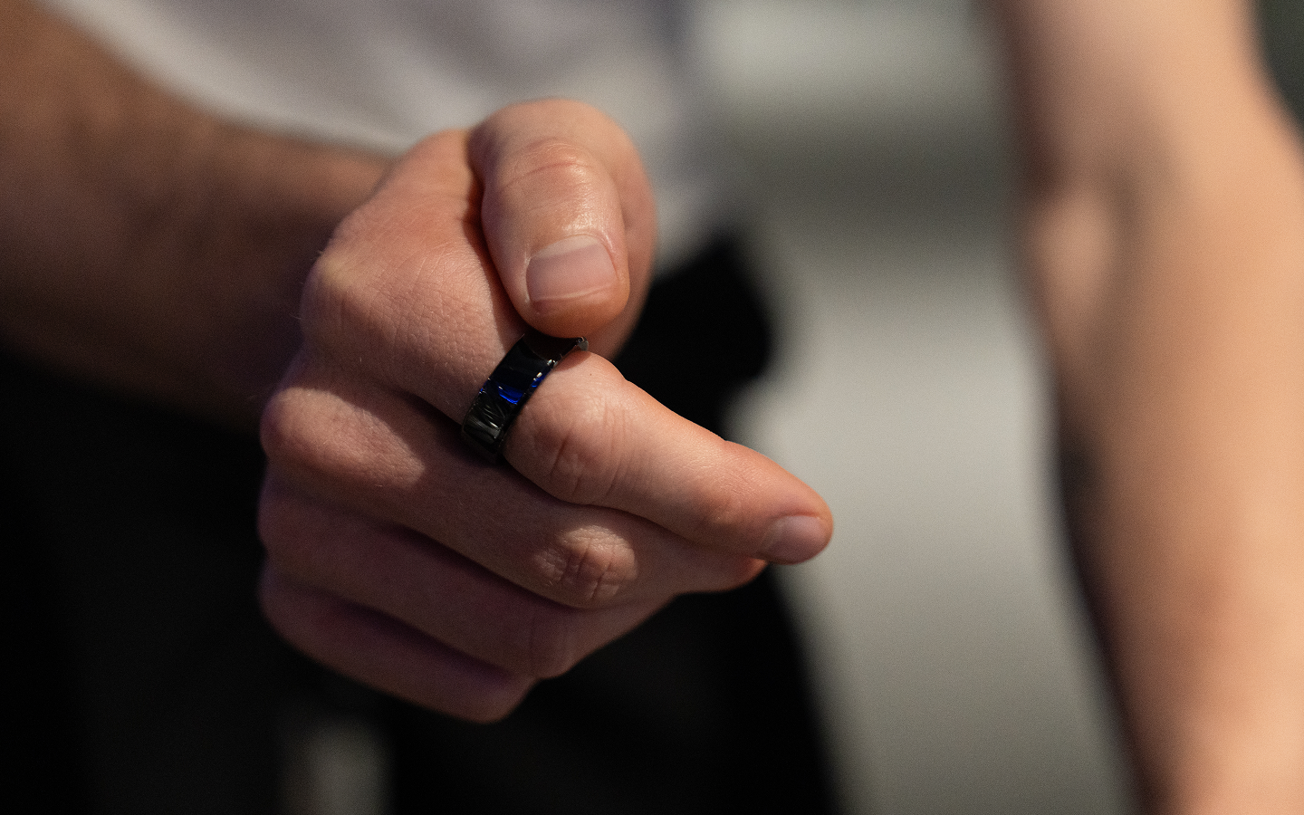
Every ring measures you.
This one answers to you.
A gesture-control ring in a category that only knows how to talk about sleep scores. How a brand-new species learned to explain itself — and got corrected by its first real audience.
Eight smart rings. All telling the same story.
Line up every major smart-ring brand and watch their launch films: sleep scores, heart-rate curves, a person lying down in morning light, an app dashboard. Eight brands, one story — the ring reads you. Not one says: you command the devices.
KiWear stands in that empty spot. An XR gesture-interaction company — Qualcomm reference design, B2B by trade — bringing its first consumer product to market: a gesture-recognition ring. Draw a circle in the air, the speaker's volume rises. Hand in your pocket, you skip tracks and take calls. One finger, up to eight devices.
The problem: consumers have no frame for that. "Smart ring" already means something — health data plus an app. The more innovative the product, the higher the cost of explanation. From day one, this project was about one thing: what to say, to whom, at which touchpoint.
A claim needs visible proof.
The positioning line settles which side of the category you stand on. It doesn't make anyone believe you. So the expression splits in two layers: the claim — a new species that operates every screen for you — and proof the eye can verify.
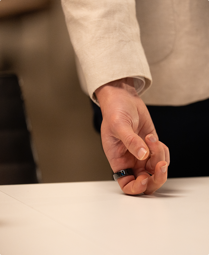
The proof is the gesture's character. Every wearable has a performance move — raise the wrist, look at the screen, tap. KiWear's gestures are small enough to happen inside a pocket: a thumb slides two centimeters, the feed scrolls. So the camera does the amplifying — every gesture in close-up, every close-up followed by the device responding. Finger draws a circle, cut, volume bar rises. Air-check, cut, call connects. The person commands; the devices follow. No spec required.



A launch isn't one film. It's a calendar.
Trade-show debut, ad pre-testing, website launch, crowdfunding. Each node meets an audience in a different state, so each piece of content has a different job — four kinds of content, each pulling its own weight. Because every touchpoint's message was locked before the shoot, three days in Melbourne collected everything: main film, 16 feature demos, product and lifestyle plates — every asset tagged to its feature number.
One counter-intuitive call: some features deliberately stay out of the film. The smart-home shots were filmed — and kept in the library. A new category doesn't need to say everything on the first date; the surprise belongs to the detail page and campaign updates.
A few hundred demos — the strategy's first field test.
KiWear's first public appearance: its own booth, Qualcomm's, and the keynote stage. Tom's Guide named it Best of AWE 2026 — "maybe the way we'll control smart glasses in the future." But for the strategy, the real value was the booth: a few hundred demos, the first collision with real users — and two results opposite to our expectations.
Can it track sleep? Is the heart rate accurate? In the public mind, smart ring = health ring. The harder you push differentiation, the more users want to confirm the basics still work. Health isn't this product's selling point — but it's the floor of trust. Without the floor, nobody has patience for the view upstairs.
The two-centimeter pocket slide — our purest "anti-performance" statement — got blank stares; most people never registered what "not touching the ring" meant. What made people gasp were the big gestures: circle the air, volume rises; check mark, call connects; two knuckle-taps, control jumps from phone to TV. And air-slicing fruit — the single best-loved, most-filmed demo on the floor.
A good demo, moved online.
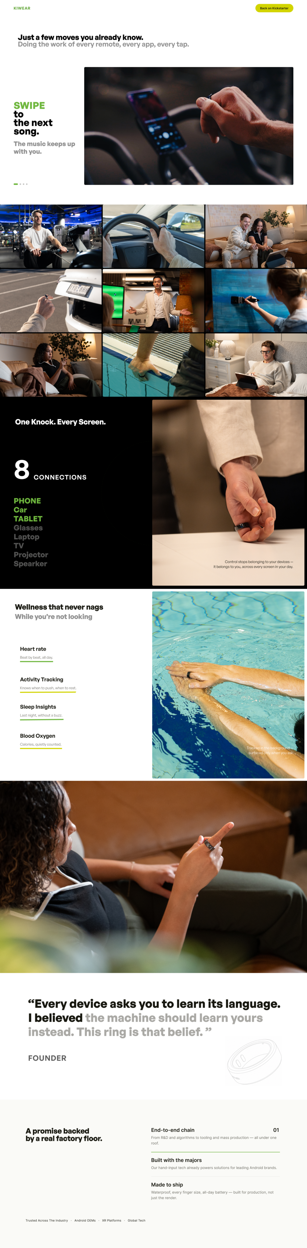
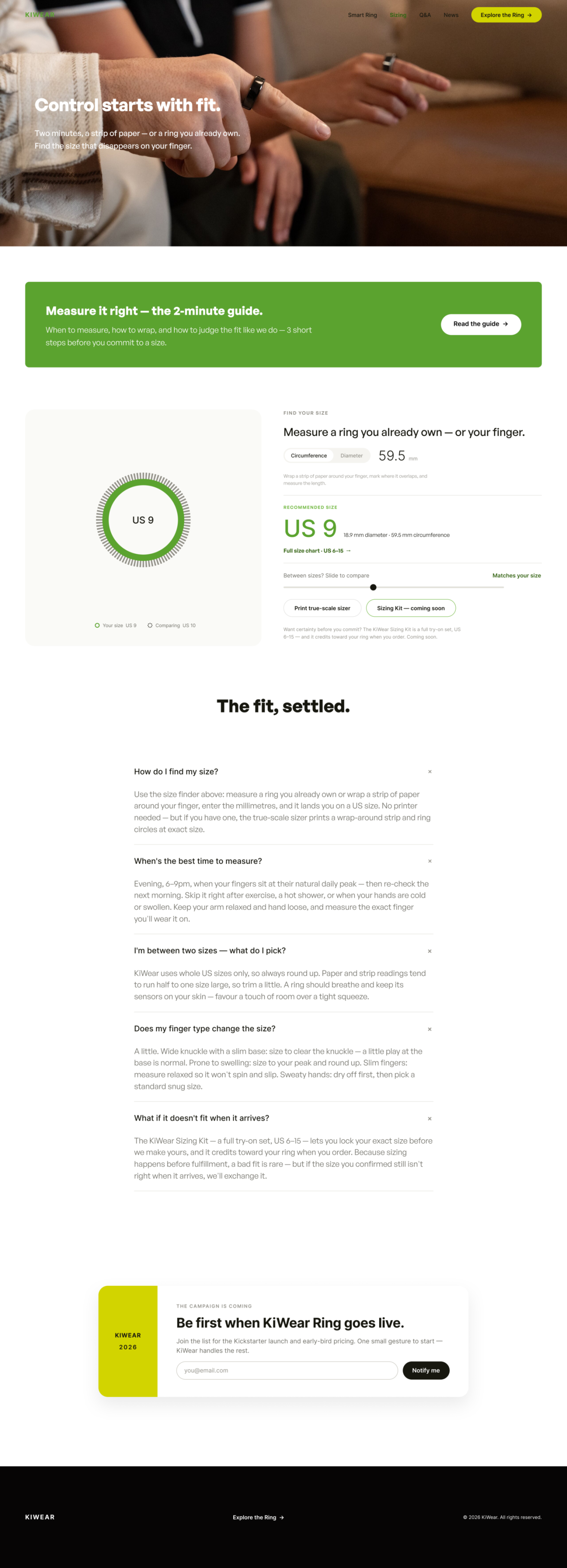
The site is where every other touchpoint lands. Its persuasion order is a booth demo, translated: positioning → gesture language → multi-device → health → press → founder. The difference leads; the trust floor holds without stealing the show. Every frame comes from the same three Melbourne days, and what video can't cover the page catches — sizing guide, Q&A, compatibility list. The films hook; the site answers.
"The feature we loved most wasn't the selling point."
The client said it on the post-show debrief call, about that two-centimeter pocket slide. Creative teams naturally fall for a product's most exquisite part — hardest to engineer, purest in philosophy, richest to unpack. But a new category's audience needs visible cause and effect: bigger motion, direct result, legible from a meter away. Between exquisite and visible, a new category should choose visible. The exquisite isn't wasted — it belongs to the detail page, to the second surprise after the purchase.
The deeper fix: sales judgment existed all along, but only as discussion — never locked into a table that drives shot selection. So the method is now standard: before any conversion-driven script, lock the priority table — the one claim to prove, its best demo, the trust floor, what folds into the closing montage. Script, storyboard, supers all grow from that table, not from the feature list. A new category has no textbook; a few hundred honest demos taught us more than any internal review. "Show real users early" now comes before "lock the content."
