
Sci-fi shouldn't stay on screen.
Gravity doesn't sell a clock — it sells the idea that sci-fi belongs on your desk. You can't sell an idea with a spec sheet. So we built a website that rehearses the product: before you ever see the object, you feel weightless on a screen.
The TVC — where the world begins.
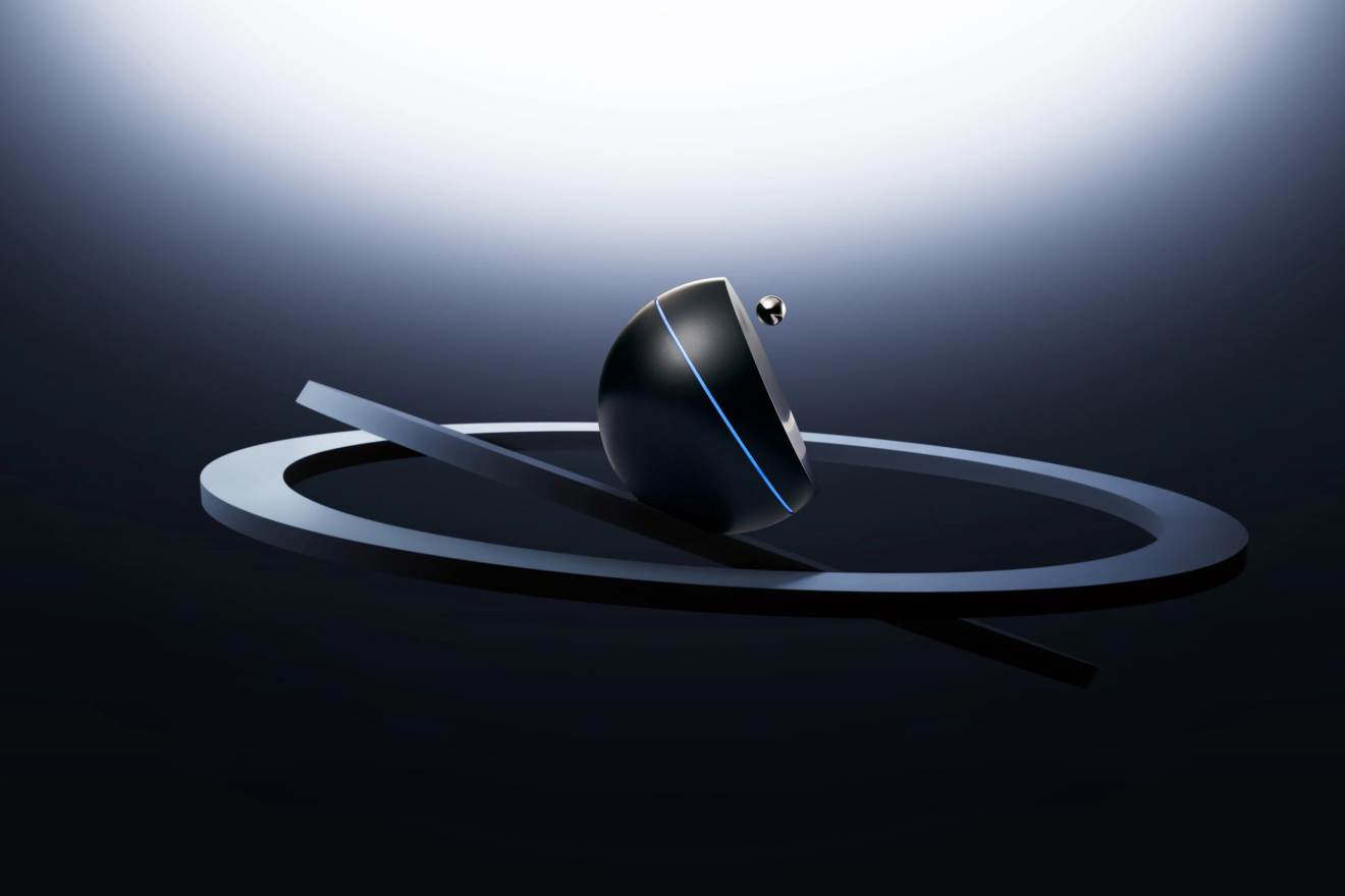
The script was written bilingually from draft one — a brand born global doesn't translate later. Film and site share one visual world: the film makes you believe the world exists, the site lets you walk through it, and the product page tells you it can sit on your desk.
A clock that reached the point of needing a brand.
Gravity didn't start from a gap in a product category — it started from an obsession with the future: space, time, levitation, things that used to live only on screens. Its own line says it plainly: sci-fi shouldn't stay on screen, it should sit on your desk.
Universe Time is a 720° levitating clock — a metal sphere floats under electromagnetic control, spinning as it orbits the dial. Paired with the app, it keeps time on eight planets. It launched on Kickstarter in early 2025, took Yanko Design's Best of IFA 2025 and two European Editors' Choice awards, then showed at CES 2026.
The trade shows proved the product. Then came the real launch: $768, limited to 500 units, sold only through the brand's own site. No flagship store, no retail presence — the website has minutes to carry a visitor from "what is this" to "I want it."
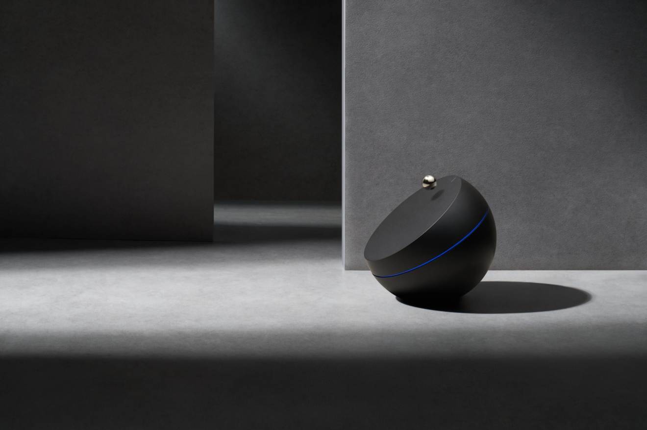
Your phone tells time faster. A spec sheet can't answer "why $768."
This product solves no efficiency problem — its entire value is the feeling of watching a metal sphere hang in the air. 720° levitation, 28dB, power-off protection: stack the features up and they still can't justify the price. Only the concept can. So we built the site as the product's first rehearsal: before you ever see the object, you experience weightlessness on a screen.
Whatever the product does, the page should make you feel.
One rule governed every interaction: the product's core experience is levitation, weightlessness, and the flow of time — every gesture on the site translates one of the three.
Right now, somewhere else.
Interaction boldness should follow the business model.
A long press loses impatient visitors, and we did that math: a 500-unit product doesn't need volume — it needs every serious visitor arriving in the right state of mind. On a volume product we would never add that friction.
A site that rehearses the product only pays off when concept outweighs function in what the customer buys. Copy it onto a spec-driven category and the money lands where buyers aren't looking.
The Gravity team's picture of "sci-fi" was complete, so every draft had to answer one question: is the sci-fi you mean the same one we're building? A clear client vision raises the precision bar — a different kind of difficult from a client who doesn't know what they want.
The site doesn't explain the product. It rehearses it.
However a visitor hears about the clock, they land on one domain, pass through one tunnel, and read everything the brand has to say inside a space built for it — no link in the chain borrows strength from anywhere else. For a brand on day one, that site is everything it owns.
When the power cuts, the floating sphere clicks back onto the dial. Sci-fi ends; gravity takes over. It might be the most honest detail in the product: it knows exactly what it's up against, every second.