Making invisible engineering visible.
Consumers don't believe a brand has real technology just because it says so.
TORRAS's R&D is real — but on a product page, a wearable AC that took years to develop looked like a $20 neck fan. The brief: turn invisible engineering into something consumers recognize on sight.
Every asset's job, defined before production starts.
Before scouting or shot lists, we mapped every asset across two dimensions: where it appears — website, product page, social, TVC, launch event — and where the product lives — outdoors, commuting, working out. Purpose drove production, not the other way around.
From storefront to tech exhibition.
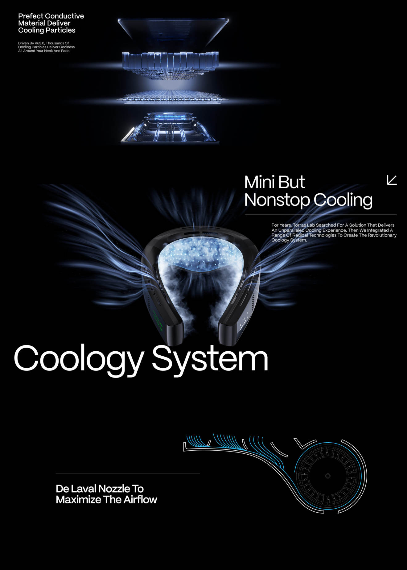
A deliberate call: no product shot on the first screen. No banner. The TORRAS logo transforms into a 3D corridor the user moves through, with Coolify materializing at the far end. From there, high-fidelity 3D peels back the Coology System layer by layer — internal structure down to microscopic airflow.
This worked because code and film sat at the same table from day one. The frontend team knew what 3D assets they were building around; the 3D team knew how the model would behave in a web interaction. Split that across three vendors and none of it lines up.
Real questions, turned into proof.
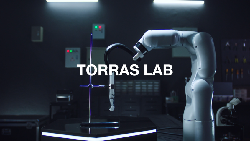
"Does the phone case yellow over time?" "How loud is the neck AC?" — actual pre-purchase questions from TORRAS customers, pulled from reviews and sales data, turned directly into the test sequences. A lab-style environment: robotic arms, decibel meters, extreme physical stress. No filters, no styling. Not flashy — credible.
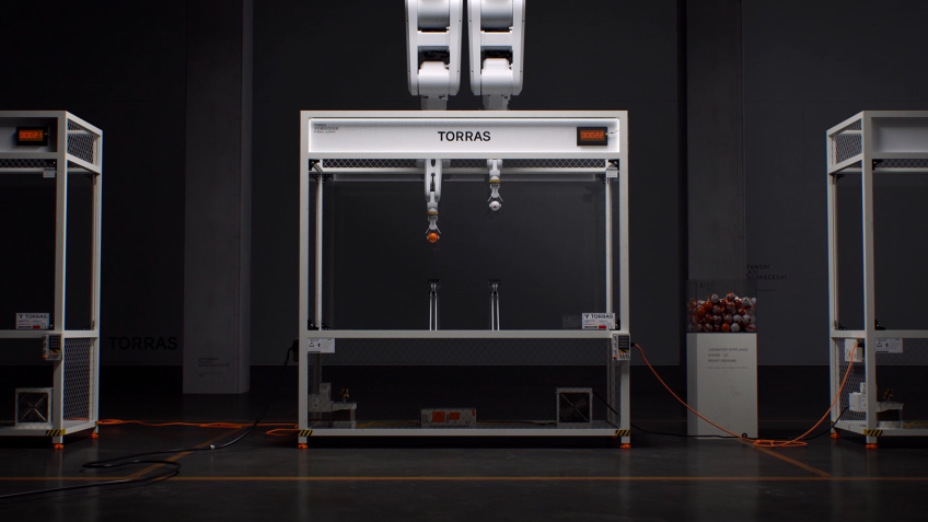
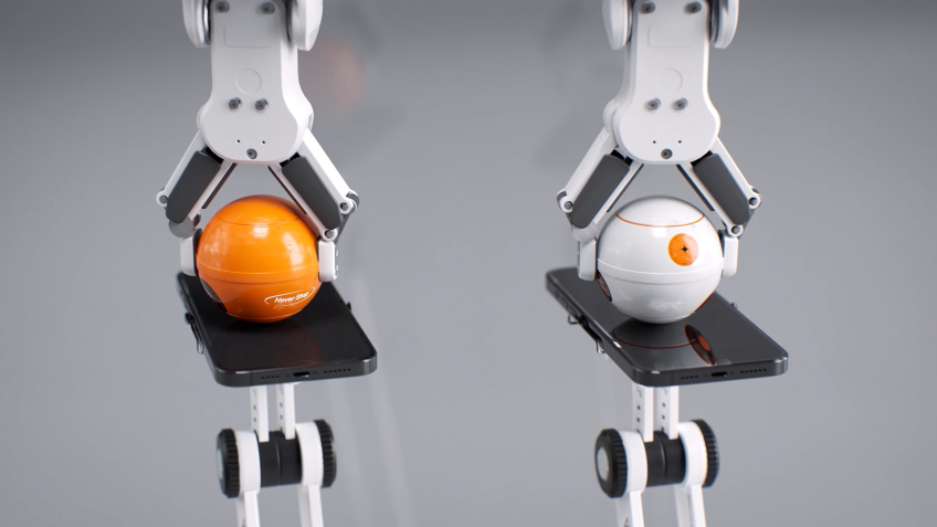
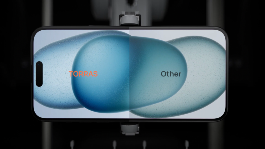
Two films, not one — and neither was standalone.
Every segment of both films was designed as an independent narrative unit, then woven into the website's scroll interaction — not embedded as a video player, but integrated so film and code move at the same rhythm. One production budget, used more than once.
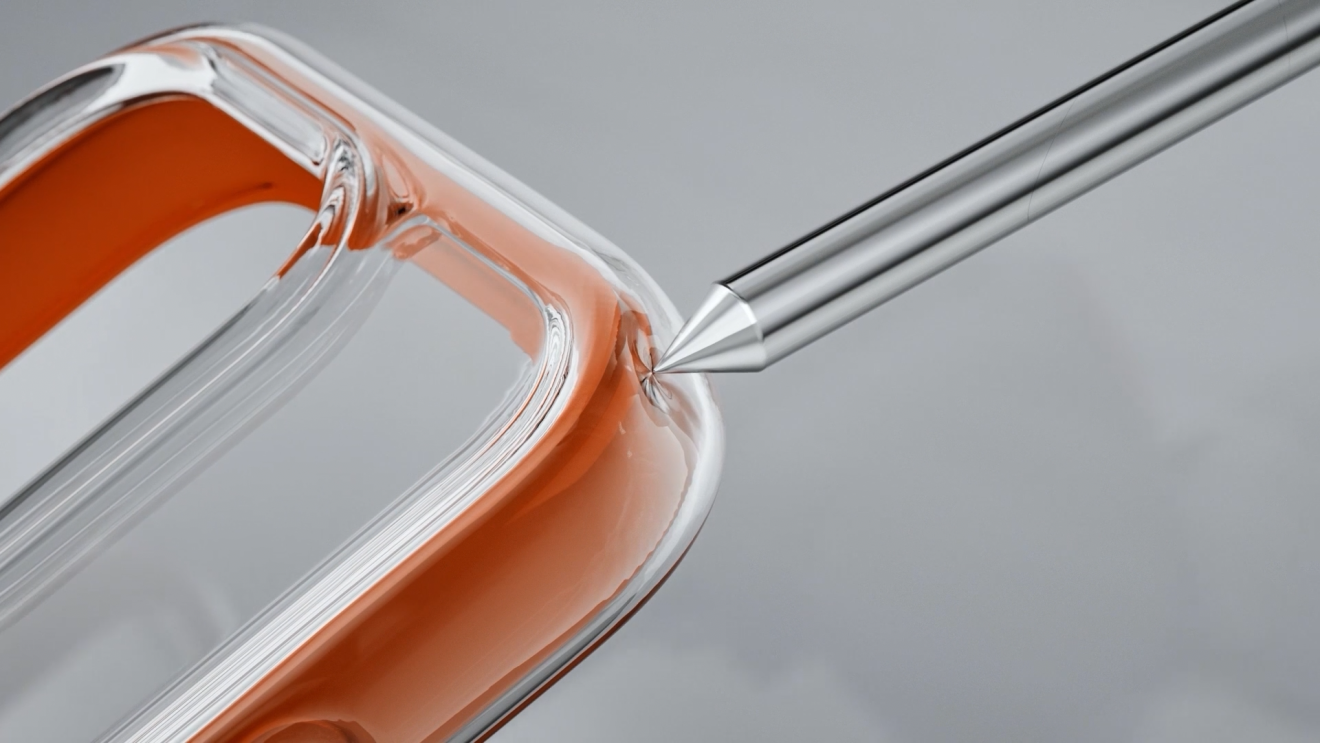

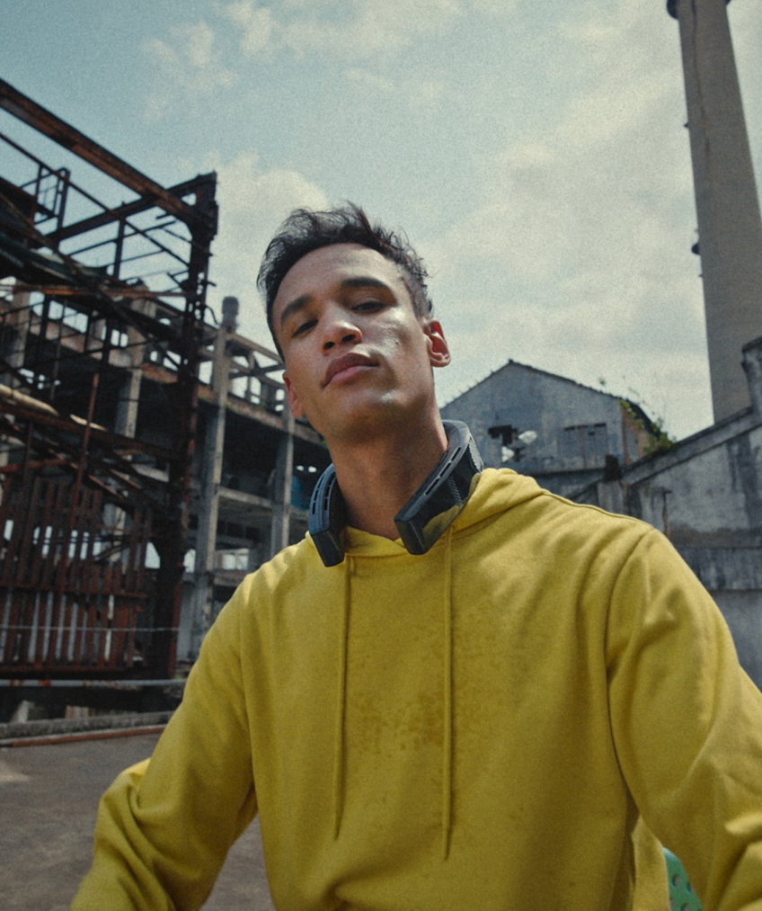
A visual library, not a pile of deliverables.
Deliberate repetition. The same motifs placed across website, social, and product pages — by design, not convenience. A visual anchor used three or more times builds recognition while maximizing the return on every asset.
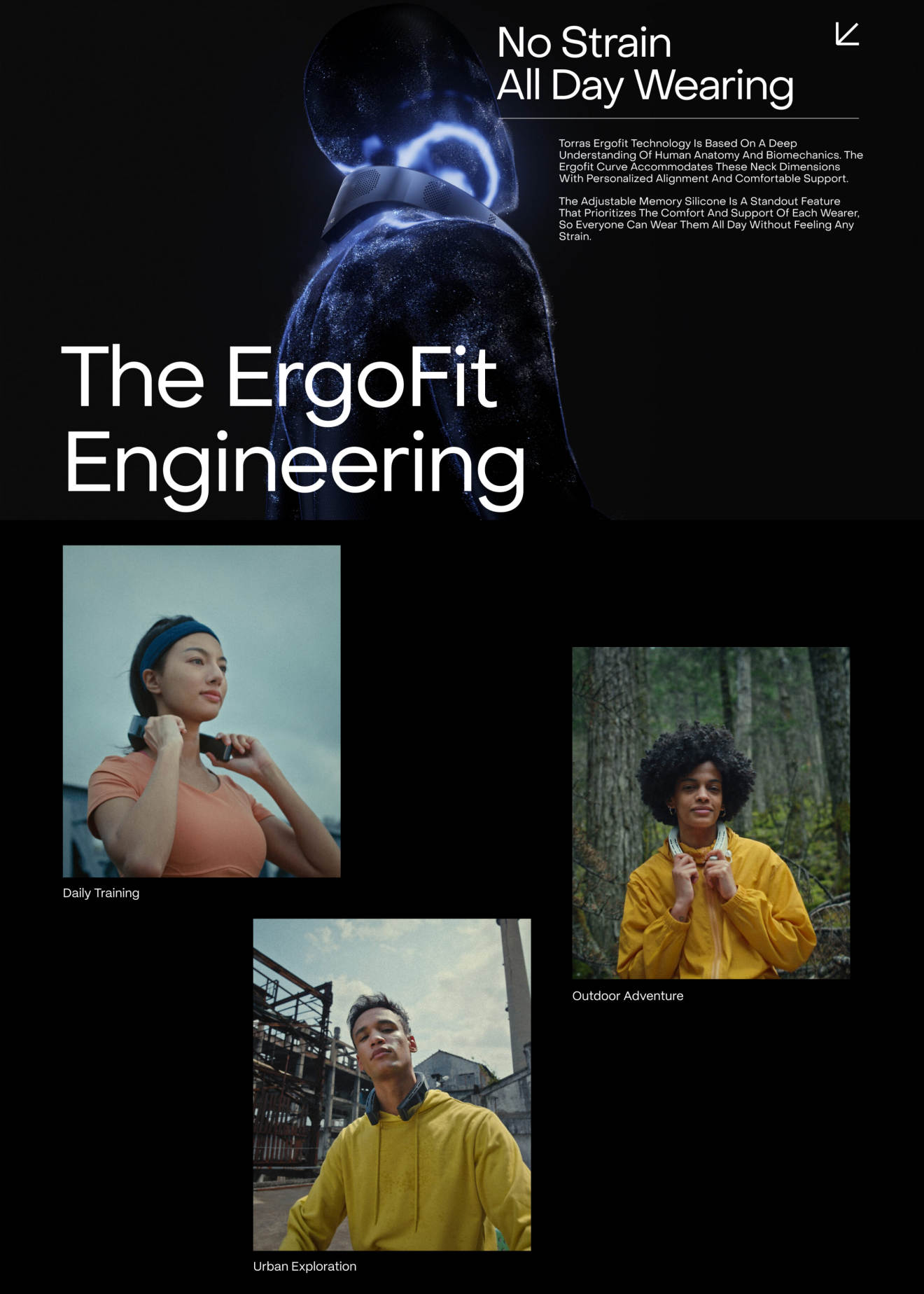
Asset granularity. One high-fidelity model of Coolify's fan assembly, broken down for every size and format — hero, product graphics, social clips, launch screen — from a single source.
Symbols that stuck. The "C" — the product's form and its initial. And "the moment you put it on" — the signature Coolify gesture. Both became recurring elements across all lifestyle and interaction content.
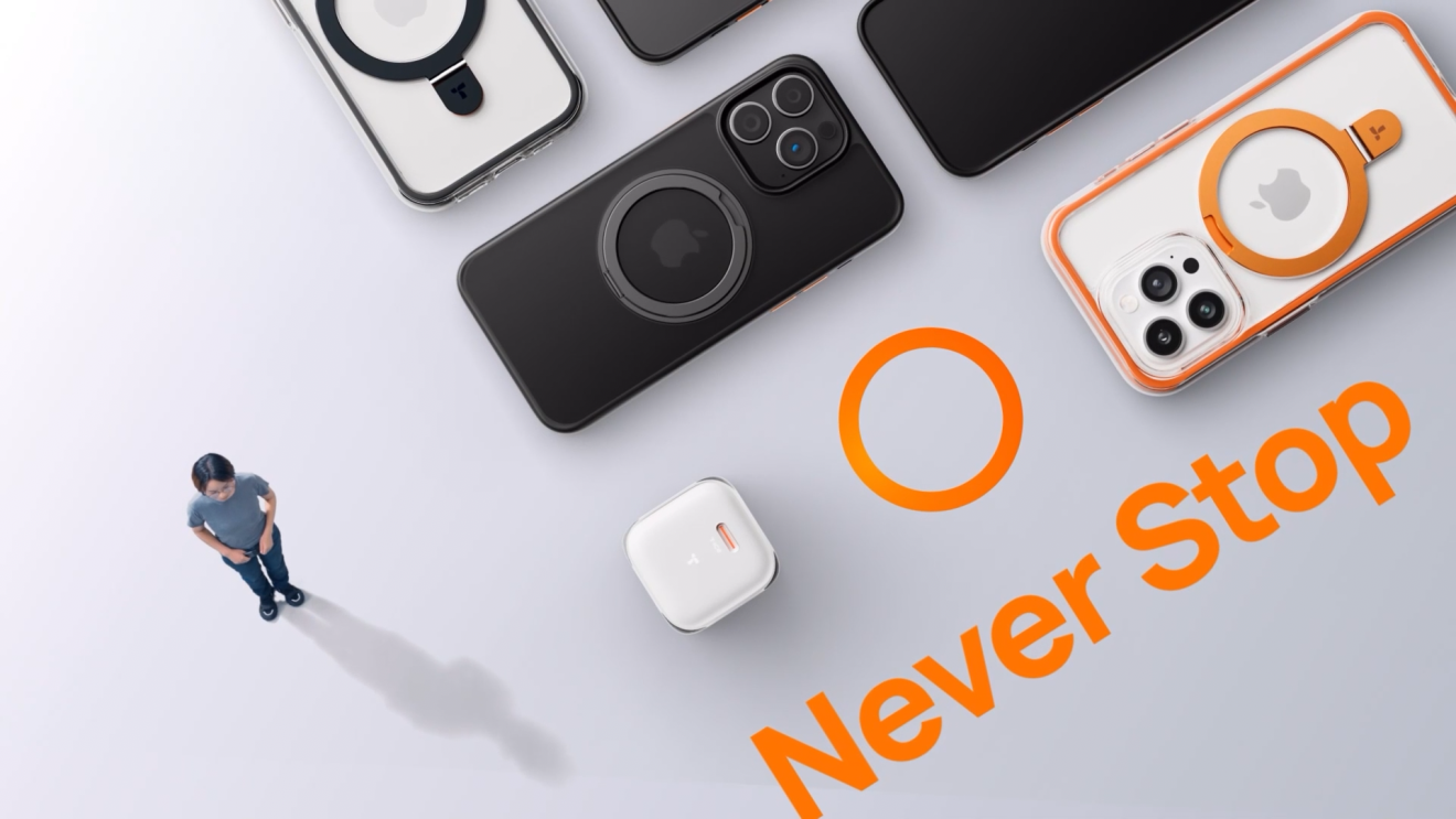
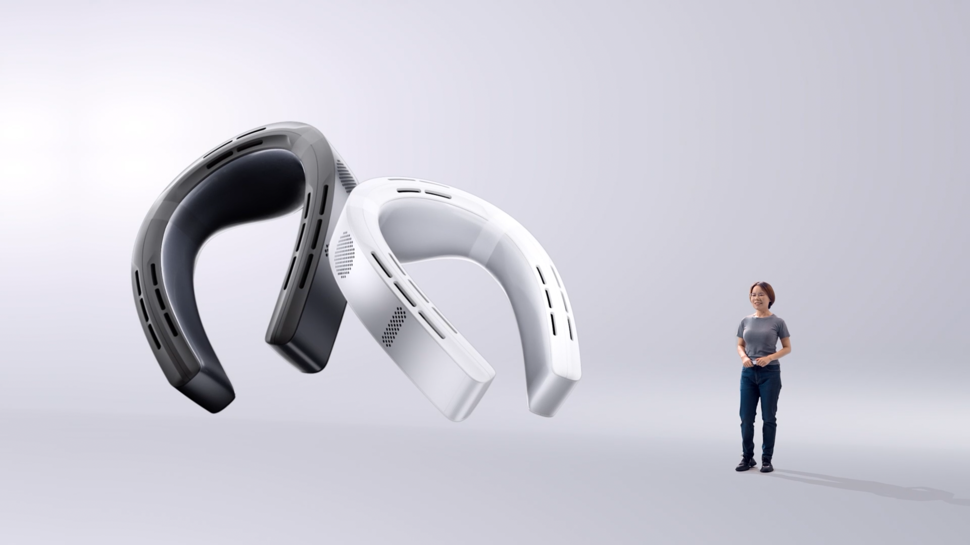
Coolify, UPRO, MegaMag — the full lineup debuted under one concept. Testing series, TVC, and symbol system, presented as a single whole.
For a product-driven brand, every step the product takes forward is the best content the brand could ask for.
TORRAS went from phone accessories to wearable air conditioning — that trajectory is the most persuasive brand story there is. No manufactured narrative needed. But it only works if someone translates the roadmap into a language consumers can receive — systematically, not as a one-off. That's what scene mapping does: before anything gets made, define where each asset will be seen, by whom, and what job it does. That's not a production optimization. It's where brand expression begins.